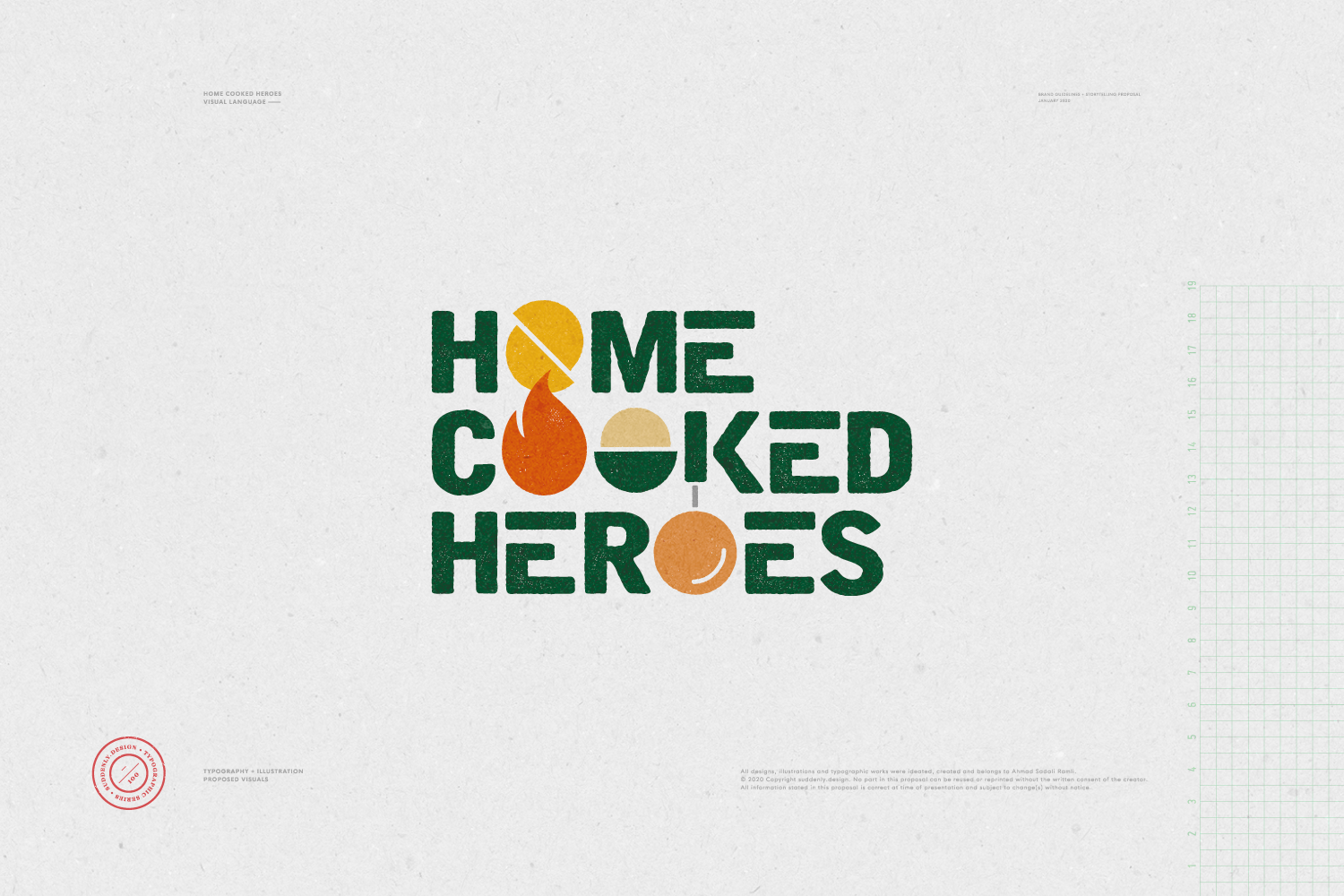
Home Cooked Heroes started off as a social media initiative by Sweet to promote simple and delicious home-cooked recipes through short clips accessible on a brand-new video platform. For the pitch, I proposed a logotype or wordmark that would brand its content and personalities.
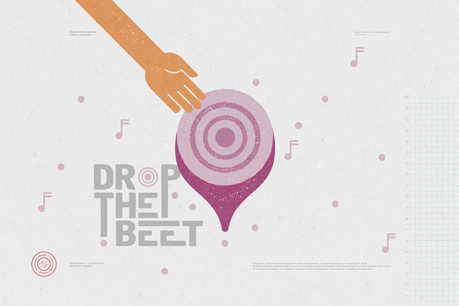
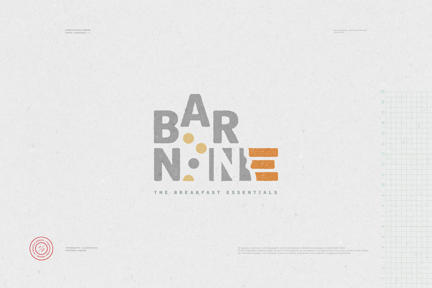
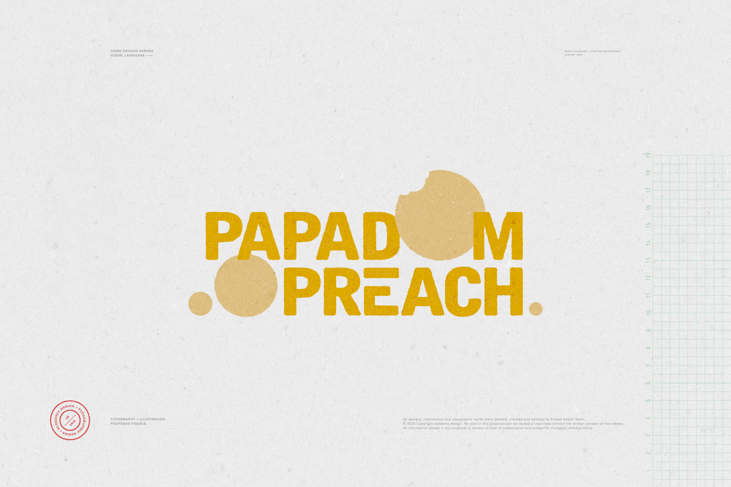
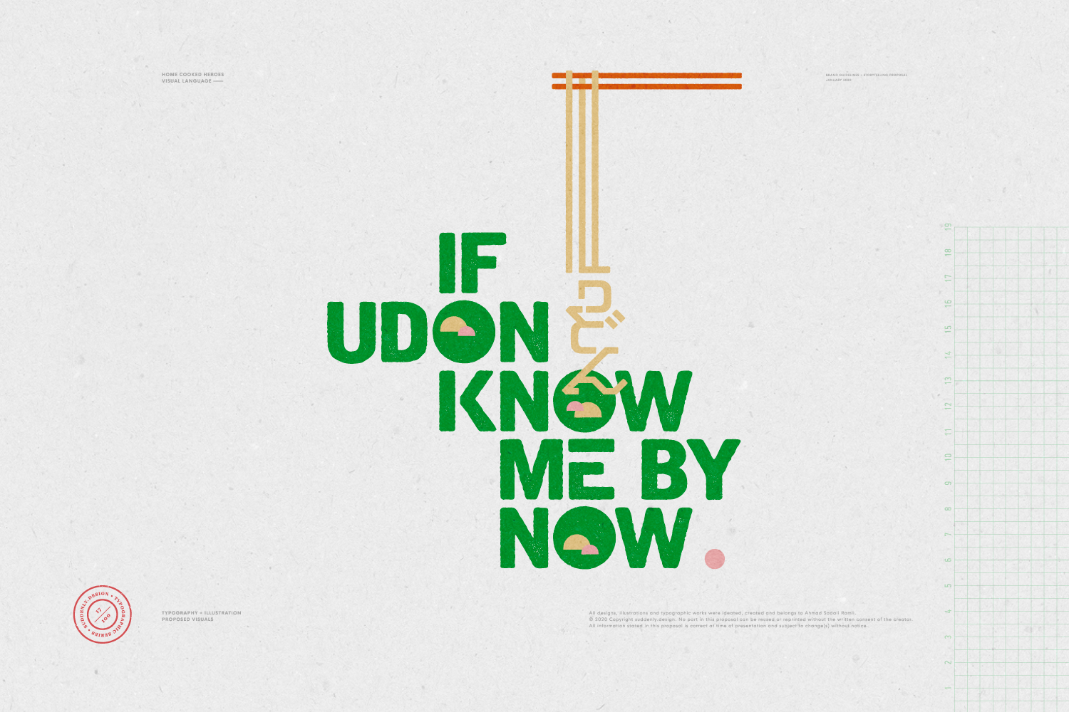
After the first round of presentation to the management, the initiative was put on hold to give way to other proposals. I took upon myself to develop the brand’s visual language further by creating a series of typo-graphics and giving voices to the upbeat identity. Grunge types were modified to convey gritty aestheticism, whilst the graphics mimic letterpress effect that screams for attention. Sometimes, wordplay takes precedent to form an idea, and in other instances, the visual pun leads to a quirky denouement.
This creative exercise is an ongoing personal project and will be updated progressively.
BRANDING | APPLICATIONS